Testimonials
Services
Designing a Dashboard
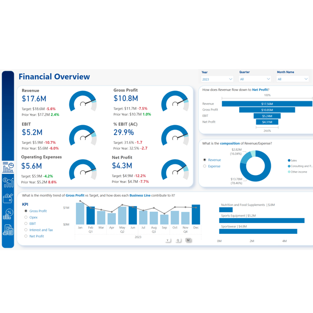
CFO Dashboard - Income Statement
6-Report Bundle
YT - Transform Power BI Tables using SVGs
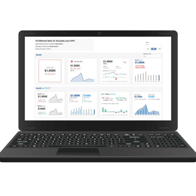
16 ideas to Visualize KPIs (Pre Nov 2025 Release)
Improve your Power BI Report
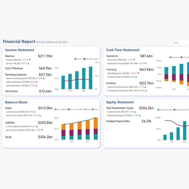
The 4-in-1 Financial Overview
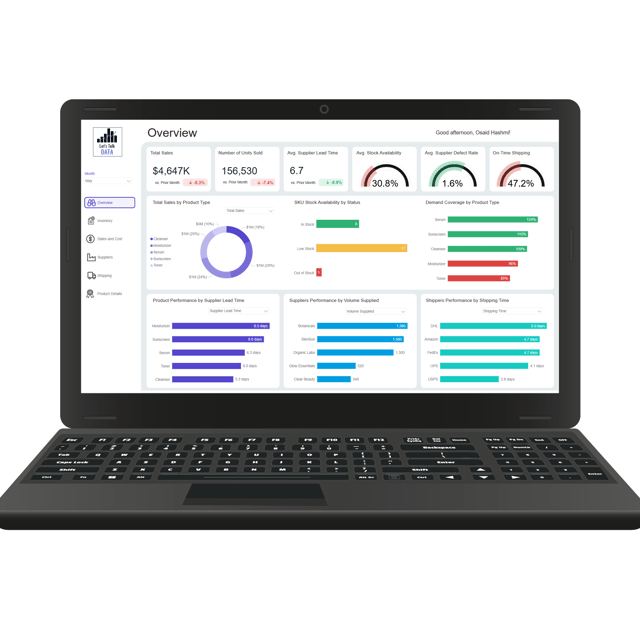
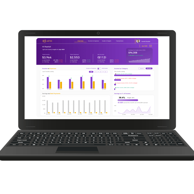
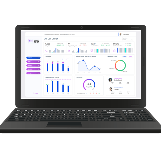
Power BI Dashboards and Ideas
About me
- I’ve had the pleasure of working with Osaid for 6 months, during which we collaborated to deliver high quality sales performance.Recommended by Zaheem Ali on

Frequently asked questions
What is the difference between a Power BI dashboard and a report?
The Power BI dashboard vs report distinction comes down to scope: a dashboard is a single page of pinned visuals that gives an at-a-glance overview, often combining visuals from several reports, while a report is a multi-page, fully interactive document built on one dataset. Use reports for deep, page-by-page analysis and dashboards for high-level monitoring of your most important KPIs.
How do I create a Power BI dashboard for the first time?
The simplest way to learn how to create Power BI dashboards is to follow the same five steps every time: clean your data in Power Query, build a basic data model with relationships, write your core measures in DAX, lay out the page with KPI cards at the top and trends below, and publish to the Power BI Service. Rebuilding one dashboard twice, once for practice and once for real, makes the workflow stick.
What are the best practices for Power BI dashboard design?
Strong Power BI dashboard design comes down to a few principles: design each page for one audience and one decision, put the most important KPIs top-left, reserve color for meaning only, remove gridlines and clutter, align visuals on a clean grid, and use tooltips and bookmarks for detail instead of cramming everything onto one screen. Sketching a wireframe before you build also saves hours of rework.
What size should a Power BI dashboard be?
The default Power BI dashboard size is a 16:9 canvas of 1280 × 720 pixels, which fits most laptop and monitor screens. You can change this in the canvas settings to 4:3, 16:9, or a custom size — 1280 × 720 is the safest choice for dashboards viewed on standard screens, while letter-sized pages work better when the report needs to be printed.
Where can I find good Power BI dashboard examples and templates?
You'll find Power BI dashboard examples in Microsoft's official template gallery and the sample files built into Power BI Desktop. Ready-made Power BI dashboard templates are also widely available for areas like sales, HR, finance, and project management — downloading a PBIX file and rebuilding it with your own data is one of the fastest ways to learn layout and modeling choices.
What KPIs should Power BI dashboards for project management include?
Effective Power BI dashboards for project management combine schedule, budget, and risk on one page: a timeline or Gantt visual for milestones, planned vs. actual dates, task-status breakdown, budget vs. actual spend, resource utilization, and an open-issues summary with KPI cards on top. If a viewer can't answer "is the project on track?" in five seconds, the layout needs simplifying.
What is Power BI DAX used for?
Power BI DAX (Data Analysis Expressions) is the formula language used for calculations that plain aggregations can't handle — year-over-year growth, running totals, percentage of total, moving averages, and conditional logic. You write it mainly in measures and calculated columns, and it's what makes a report respond dynamically to slicers and filters instead of showing static numbers.
How to learn Power BI DAX as a beginner?
The most practical way to learn Power BI DAX is to build up in layers: start with basic aggregations like SUM, AVERAGE, and COUNT, then master CALCULATE, then filter functions like FILTER and ALL, and only then move on to iterators and time intelligence. Learn filter context early — it's the one concept that explains why the same formula returns different numbers in different visuals.
What are Power BI DAX measures?
Power BI DAX measures are dynamic calculations evaluated on the fly based on the filters applied in your report, unlike calculated columns, which are computed once per row and stored in the model. Because measures don't store data, they keep file sizes lean, and a single measure can show a different result in every visual — which is why they're the recommended way to build KPIs in Power BI.
Should I use SWITCH or an IF statement in Power BI DAX?
A Power BI DAX IF statement is ideal for simple two-way logic — IF(condition, result_if_true, result_if_false) — but nested IFs quickly become hard to read. The Power BI DAX SWITCH function evaluates conditions in order and returns the first match, making it the cleaner choice for three or more branches, such as bucketing sales into performance tiers.
Is there a good Power BI DAX cheat sheet?
Yes — most Power BI DAX cheat sheet references organize the language into practical categories: aggregations, filter context, time intelligence, and logical functions. Microsoft's official documentation works as the complete Power BI DAX functions list, with syntax and examples for every function, so a good habit is keeping a short personal sheet of the 10–15 functions you use weekly and relying on the full reference for the rest.
How do I create a dashboard in Excel?
Learning how to create Excel dashboards follows a reliable recipe: structure your source data in Excel Tables, summarize it with PivotTables, build PivotCharts from those summaries, and connect everything with slicers and a timeline so one click updates the whole page. Most Excel dashboards for beginners work best when the layout is sketched first and formatting is saved for the very end.
What is an interactive Excel dashboard?
An interactive Excel dashboard is a report page where the user, not the designer, controls what's shown — typically through slicers, timelines, drop-downs built with data validation, and PivotCharts that recalculate instantly when a filter changes. Done well, one interactive Excel dashboard can replace dozens of static weekly reports because the same page answers different questions for different people.
Excel dashboards vs Power BI: which one should I use?
The Excel dashboards vs Power BI decision usually comes down to data size, refresh, and audience. Excel wins for smaller datasets, quick one-off analysis, and teams that already live in spreadsheets; Power BI wins when data volumes are large, you need scheduled automatic refresh, or many people need one shared interactive view. Many analysts build Excel dashboards first, then move to Power BI once the data outgrows them.
Where can I find Excel dashboard examples and templates?
Excel's built-in template gallery is the best place to start for Excel dashboard examples — go to File → New in Excel and search "dashboard" to see ready-made options for budgets, project trackers, and KPIs. Excel dashboard templates are great for studying layout and structure, but rebuilding one against your own data teaches you far more than using it as-is.