Testimonials
Services
Report Review Session/Brainstorming
Have a question?
Power BI Table Pagination Using a Slicer
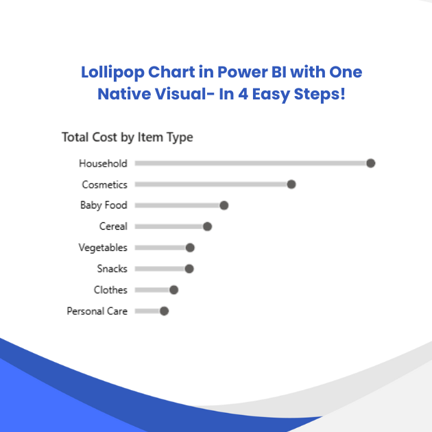
Lollipop Chart in Power BI with One Native Visual
Collaboration/Influencer Connect
Data Analyst Path Mentorship
Wireframing in Power BI Template
Requirement Gathering Checklist
Display multiple slicer selections in a card
Power BI Shape Map Resources
About me
- Read My Articles Herehttps://medium.com/@santhanalakshmip

Frequently asked questions
What is a Power BI dashboard used for?
A Power BI dashboard is used to monitor key metrics at a glance. It is a single-canvas view in the Power BI Service where you pin visuals — KPI cards, charts, maps — often from multiple reports, so decision-makers can track performance without digging through full reports page by page. It is built for high-level monitoring rather than deep exploration.
What is the difference between a Power BI dashboard and a report?
The Power BI dashboard vs report distinction comes down to scope and where each lives. A report is built in Power BI Desktop, can span multiple pages, and stays fully interactive with slicers and cross-filtering tied to one data model. A dashboard is created in the Power BI Service by pinning visuals — possibly from several reports — onto one canvas, making it better suited for at-a-glance tracking than detailed analysis.
How to design a Power BI dashboard?
Start before you open Power BI: gather requirements, list the decisions the dashboard must support, and sketch a wireframe of the layout. While building, follow a consistent grid, use a restrained color palette, place 3–5 KPI cards at the top, and position slicers where the eye lands first. Running through a pre-publish checklist before sharing helps catch alignment, contrast, and labeling issues.
Where can I find good Power BI dashboard examples?
Microsoft's official sample datasets, the community Data Stories Gallery, and dashboard design showcases are great starting points. Studying Power BI dashboard examples from real business scenarios — sales, finance, HR, operations — is the fastest way to pick up layout, color, and KPI placement ideas you can adapt to your own data.
Are Power BI dashboard templates worth using?
Yes, especially when you are starting out. Power BI dashboard templates give you a tested layout, theme, and structure so you can focus on the data instead of formatting from scratch. Even a simple wireframe template helps you align on the layout with stakeholders before building. Just customize the colors and KPIs to your own brand and metrics rather than using a template as-is.
Can I build a Power BI dashboard in a day?
Yes — a Power BI dashboard in a day is realistic if your data is already cleaned and the scope is small: connect the dataset, build a few core visuals, add slicers, and publish. What takes longer is data modeling, DAX, and design polish, so treat a one-day build as version one rather than the final product.
How to publish a Power BI dashboard?
Open your report in Power BI Desktop, select Publish, and choose a workspace. Then sign in to the Power BI Service — note that dashboards themselves are created there: you publish the report first, open it, and pin the visuals you want to a new or existing dashboard. Sharing beyond your own workspace requires a Pro license (or Fabric/Premium capacity) and properly configured permissions.
How to learn DAX in Power BI?
Start with the fundamentals — row context and filter context — then practice writing simple measures such as total sales or year-over-year growth before moving on to CALCULATE, FILTER, and time intelligence. Rebuilding existing report visuals from scratch is one of the fastest ways to learn, and following a structured learning path or getting guidance from an experienced mentor helps you avoid picking up bad habits early.
What are Power BI DAX measures and how are they different from calculated columns?
Power BI DAX measures are calculations evaluated on the fly, at query time, based on the filters applied in each visual — which makes them ideal for totals, ratios, and KPIs. Calculated columns are computed once per row during data refresh and stored in the model. As a rule, prefer measures: they are more dynamic and do not inflate your model's memory.
Where can I find a good Power BI DAX cheat sheet?
The most useful Power BI DAX cheat sheet groups functions by what you are trying to do — aggregation, filtering, time intelligence, text, and logical logic — rather than listing them alphabetically. Microsoft's official function reference combined with community cheat sheets covers the essentials. If you are preparing for the PL-300 exam, pairing a cheat sheet with condensed notes on visualization and the Power BI Service works especially well.
How to make a Power BI slicer searchable?
Select the slicer, open the Format pane, and enable the search option under Slicer settings — a search box then appears at the top of the slicer. For long lists, you can also switch to a text-filter slicer so users can type what they are looking for instead of scrolling, which noticeably improves usability on large datasets.
How to make a Power BI slicer drop down?
Select the slicer and, in the Format pane under Slicer settings, change the style from Vertical list to Dropdown. A Power BI slicer drop down collapses into a single line, saves canvas space on dense dashboards, and still supports multiple selection and search.
How does Power BI slicer multiple selection work?
Power BI slicer multiple selection is built in: users hold Ctrl (Cmd on Mac) and click to pick several values, and there is also a setting that enables click-based multi-select without holding any key. If you want all selected values displayed in a single card visual instead of just the first one, wrap your measure in CONCATENATEX so the card lists every chosen item.
Can I set a Power BI slicer default value?
Yes. Simply select the value or values you want before saving the report — slicer selections persist as the default state once the report is published. For a one-click reset, create a bookmark with the slicer cleared and add it as a bookmark button so users can return to the default view at any time.
Power BI slicers vs filters: which should I use?
Slicers are visuals on the canvas that users can see and interact with, while filters live in the Filters pane and are typically set by the report author. In the Power BI slicers vs filters trade-off, use slicers for the two or three fields your audience filters most often, and tuck everything else into the filter pane — too many slicers clutter the page and weaken the design.